Take Your Viewer on a Journey

It’s fall here in Connecticut, and I have recently been enjoying painting country roads. I find them to be such a beautiful metaphor for the journey of life. Meandering paths to unknown destinations, embracing the beauty around us, and taking the road less traveled. These country roads remind us that life is so much more about the journey than the destination. They also give us a great opportunity to design the flow into our work.

I would love to share a few ways you can strengthen your design in your landscape paintings. 


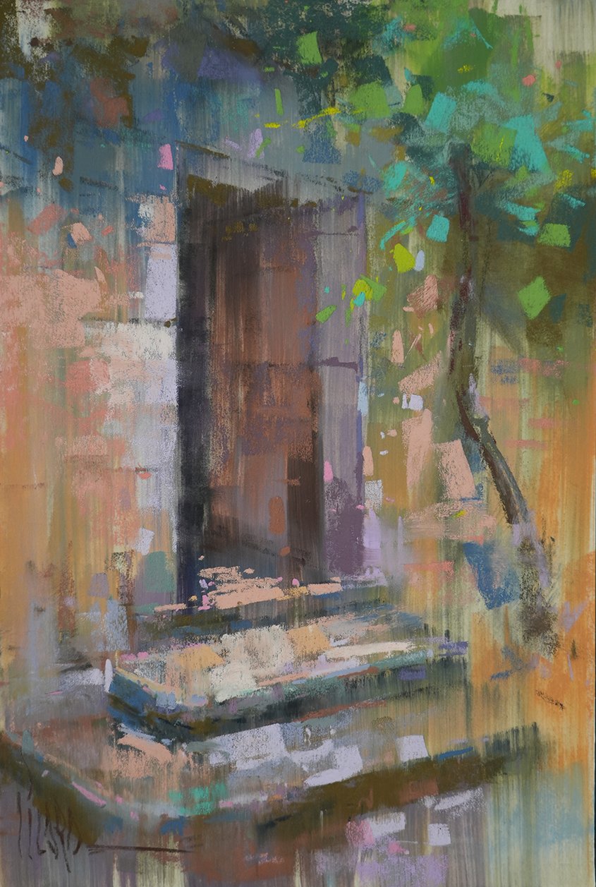
☑️ Compose with Thumbnail Sketches

When it comes to designing the flow, it’s always the right time for thumbnail sketches to search out your composition. Thumbnails help you to simplify the basic values of your scene as you break it down to the basic abstraction and look for depth, flow, shapes and structure.

☑️ Anchor Your Focal Point 

Consider the place in the scene that really attracts you to it, the area that calls your interest. This is the focal point. When you identify this spot, you can consider how the structure of the composition will lead you into and through this important area, then assess other parts of the scene that may need to be cropped or altered in order to keep the emphasis on your focal zone. A focal point doesn’t need to be a parking spot in the painting, it can be a lovely place to linger along the way. 

☑️ See Value Masses 

Simple value masses are critical to strong design. You should narrow them down to just 3 or 4 basic values for thumbnail sketching. Keep them simple! Be sure to squint your eyes and look for strong abstract shapes, rather than focusing on specific things like trees, fences, fields, and roads. Think abstractly in terms of light and dark value masses and try to eliminate details.

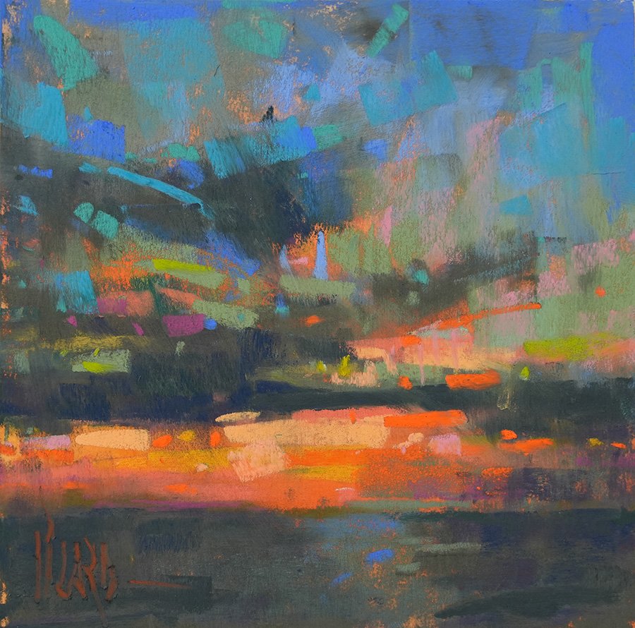
Alain Picard, “Gaining Momentum,” 7x16” Pastel on UART500

I hope these tips help create a flow of design that takes the viewer on a fulfilling journey through your work. Keep creating and sharing the beauty you see with the world around you!

Be inspired,

Alain 

PS. Looking for a country road to paint? Enjoy this video of the European countryside and paint along! Landscape Painting Demo - Blue Country View

How To Finish Your Painting


Alain Picard “Radiant Sunset”, 10x10” pastel


It’s an all-too-common problem.

A painting begins with great enthusiasm. Things are going famously as you set off on your creative adventure. Fresh energy and crisp color leave you feeling confident after your first painting session.
But…a few things could use some refinement.


So you return to the painting for one more session to make needed adjustments. That’s when things get complicated.

Have you ever been there, Friend?

Your effort to refine the work ends up costing you valuable color freshness. Bold mark making from the start begins to slip away as you add the details. How do you refine a painting without overworking it?

That’s what this video was all about.

Watch me refine a radiant sunset scene with needed adjustments while retaining that loose, painterly quality that we’re after.

Is Pastel Drawing or Painting? The Answer to your question revealed…

Do you ever wonder whether pastel is a drawing or a painting medium? 

I often get asked the question, “Aren’t pastels used for sketching, and not a real painting medium?” It’s an understandable question, given all the myths that have surrounded pastel for centuries. Myths like, “Pastels are incredibly fragile” and, “The colors fade quickly.” These misconceptions have no substance at all, yet they have remained in the culture for generations. Let’s take a brief review of pastel history to guide us.

Left: Sketch by Leonardo's assistant, Giovanni Antonio Boltraffio, Right: Andrea Quaratesi by Michelangelo Buonarroti 1532

​​Renaissance masters like Leonardo da Vinci (1452-1510) and Michelangelo (1475-1564), used natural chalks for drawing and creating preparatory studies. It was from this origin that the medium of pastel was born. Originating in Northern Italy in the 16th century, it was produced from pure powdered pigments mixed with enough gum Arabic, fish or animal glue to bind them together. Pastel was only available in red, black and white at the start. Now, there are literally thousands of different hues and shades available with incredible light-fastness and an almost limitless shelf-life. 

Pastel became quite fashionable during the 1700’s, with pastel portraits garnering the same prices as oil commissions in Britain. It was considered to be the height of fashion to have your portrait captured with a “crayon painting” as the affluent called them at the time. 

Frances Cotes, Portrait of Topham Beauclerk, 26x21.5” pastel, 1756

Yet fashions shifted, and pastel fell out of favor by 1820, with few professional artists using it at all. Then in the 1860’s, impressionists like Edgar Degas began to use pastel in new and exciting ways, and literally transformed the public perception of pastels from a sketching tool to a legitimate painting medium. Before long, titans of impressionism such as Monet, Gauguin, Renoir, Toulouse-Lautrec and Matisse were using pastel.

Edgar Degas, After the Bath, 1890-1893, 26x20.75” Pastel on mounted paper

Degas demonstrated for us that pastel can be used as a brilliant and complex painting medium to develop richly pigmented works of fine art that now hang proudly alongside their oil siblings in the greatest museums of the world. 

Artists of today continue their exploration of pure pigment as a painting medium. Washes and underpainting techniques have developed on a variety of sanded pastel surfaces. This has enabled a range of painterly methods in pastel to take on even more variety. There is no limit to the ways pastel can be used to produce painting effects that last for generations with excellent lightfastness. From thin, transparent qualities to bold, opaque colorful marks, pastel is capable of bringing your unique creative vision to life.

“Entrance to the Mill,”12x8” pastel on sanded paper

“Entrance to the Mill” was recently created en plein air in Southern France, depicting a stone doorway that led into an authentic working French mill. Using an underpainting wash with pastel to create a transparent layer of soft-edged atmosphere, I then applied soft pastel directly over to add bold mark making and sparkling color. This kind of wet-in-wet approach to painting is generally considered the domain of oil painters, yet here we enjoy these visual qualities in pastel.

With access to higher quality and greater diversity of pastel sticks and surfaces than ever before in the history of art, it is a wonderful time to be a pastel painter. I want to invite you to join me in furthering the rich tradition of innovation that pastel has to offer, and take part in a colorful renewal that is taking place.

Let's paint!
Alain Picard

It’s Time To Get Uncomfortable!

We all aspire to grow, don’t we?

Whether it’s taking on a new subject, gaining mastery in our medium or trying something new, we want to get better. Yet it seems that creative growth is often hard to predict and difficult to maintain. Why is it that some are able to keep growing while others get stuck, and how do we keep moving forward even when it feels like we’ve plateaued? For starters, we've got to move out of our comfort zones into an experience that activates growth. 
 
Here's Four Ways You Can Get Uncomfortable And Grow:

1. Do It Differently – Whatever your standard operating procedure is as you work, change it. Mix up your routine. Work from the outside in instead of the inside out. Try a different surface and progress from dark to light instead of from light to dark. Change your brush size. Flip your work upside down and paint the reverse image, just do it differently to break the pattern that lulls you into sameness. Usually work small? Try going big!

2. Try a New Subject – Are you a landscape painter? Give still life a try. Do you usually paint portraits? Paint en plein air. A new subject or environment can bring with it entirely new ways of seeing the world with artists' eyes.

3. Set Limitations – We often think creativity results from greater freedom, but I have found that creative ideas thrive on limitations. Dr. Seuss wrote Green Eggs and Ham with only 50 words! Try a limited palette, set a time limit of just 30 minutes for your next painting session, or create a painting in 100 strokes or less. You get the idea. Limitations can foster powerful creative breakthrough in your work.

4. Gain a Fresh Perspective – Stimulating fresh creative ideas can also result from having your assumptions challenged. Take a workshop with an artist who has a different approach. Read an art book that will stretch your normal creative process. Invite feedback from a trusted source and find out where they think your growth opportunities lie. Invite a fresh perspective to stimulate growth.

These are just four ways to flex your creative muscles and activate forward movement. Just remember, learning is a joyful act of discovery, and you are capable of doing hard things! Consider the feeling of discomfort a sign of adventure.

“Crashing Waves” 9x9 pastel

I recently had to face my own comfort zone head on and take on a growth mindset. Requests were coming in to teach about waves and I was avoiding the subject entirely because, well… “I don’t do waves.”  I continued in my rant, “I’ve got friends and colleagues who are masters of seascape painting, what could I possibly offer on this subject of painting waves?”

After breaking free from the fixed mindset spell that I was under, I decided to face the discomfort, push past my fear, and surrender to the creative process instead of standing still. While it was uncomfortable and at times stressful to try something new, the result was quite invigorating and resulted in fresh growth for me as an artist. I found the subject matter to be exciting and new.


We’re all in this together, friend. I broke through my comfort zone and discovered fresh growth. Now it’s your turn to push out of your safe harbor and get uncomfortable. You’ve got this, and exciting new adventures await on your creative journey!

Keep painting and be inspired!
Alain

How To Capture Movement in Your Art

Are you drawn to painting movement in your art? From the graceful expression of a dancer to the powerful action of an athlete or animal, capturing movement in your art can be a very exciting experience. Finding the flow in your work doesn’t have to be complicated, but it does require a strategy. I have found that preliminary sketching in monochrome really helps me to discern where the activity of the figure should be described.

Charcoal sketches in monochrome are my favorite way to find the movement of the subject. Soft vine charcoal, or willow, is well-suited to a loose and expressive drawing that shows off a variety of lost and found edges. This is key to expressing movement. While some consider vine charcoal to be messy, I think it’s the ideal way to play with edges and capture motion. When you need a little more contrast than charcoal allows, try layering some black or white hard pastels over for accenting. Monochrome studies are such an amazing way to practice

The Crescendo, 16x12” Monochrome Study on Strathmore 400 Toned Gray

Here are some things to think about when creating Monochrome Studies:

  • Try using toned paper to give you more atmosphere in your drawing. 

  • Work bigger when creating a monochrome, anywhere from from 9x12” to 18x24” to allow for gestural lines that use your whole arm and come from the body. 

  • Take some time to understand the proportions of the figure by using head units, and discover how many heads make up the vertical length of the subject. 

  • Let a variety of soft, broken, lost and hard edges emerge in your study.

  • Focus on the contour or outside shape of the subject for design impact

  • Use black and white chalk or hard pastel to add contrast to your charcoal study

  • Keep it loose! Don’t overwork your study and lose the energy.

Use these ideas to help you explore a loose, expressive charcoal of a figure or animal study that is filled with dynamic motion. When you’ve got a good plan established, use your Monochrome Study as a blueprint for a larger work in color! 

I want to encourage you to continue creating and sharing your artwork with others. The world needs the unique expression of beauty that only you have to offer.

How to Set your Colors Ablaze

Do you want to know how to use bold, expressive color in your paintings that is full of freshness and excitement? 

I’ve got two words for you…Color Studies. 

I just returned from Kelowna, BC after enjoying a landscape workshop with a delightful group of artists. What a blessing to be able to gather together and learn from one another again, inspire each other, provide encouragement and gain motivation to keep sharing the beauty of pastel with the world.

During my stay, I had the joy of sharing painterly techniques with the group, including the transforming power of risk-free color studies. I’m a full-fledged color addict at this point. These little paintings are an amazing opportunity to explore your color concept without all the pressure of a finished work of art. They invite us to take risks as well as give us permission to just play for a little while. 

But in order to see results, we’ve got to hold true to the two cardinal rules of risk-free paintings:

Hovering, 6x6” Color Study

Keep it Small

No bigger than 6x8.” Bigger studies will tempt us to get overly invested in the work and treat it like a precious painting that needs refinement. As soon as that happens, risk-taking is out the window!

Make it Quick 

No longer than 30 minutes. A time limit is essential to give you the urgency to be bold and suggestive. After all, you’ve got to create an impression of the entire scene in a half hour or less. 

Think of it this way, William. How long does it take you to do the dishes? That’s right, about 30 minutes. How long does it take you to watch an episode of your favorite show? 30 minutes. Surely you can allow yourself 30 minutes of creative play on a small sheet of pastel paper! Keeping it small gives you permission to take chances because it’s only a scrap of paper after all. 

These risk-free color studies have changed the way I paint, altered my approach to color, and transformed my mark-making over the years. I can’t say enough good things about them. 

When you create a color study that speaks to you, try scaling it up to a larger work so you can spend more time developing the painting. I’ll warn you though, there is some strange magic that occurs in these little color studies, and you just might end up falling in love with them just like me. 
I dare you to try a risk-free color study. Remember to keep it small and make it quick in order to see the results you're after. This tricks your inner artist critic into thinking you’re just washing dishes, and you can get away with all sorts of illicit adventures in color!

Enjoy the rush,
Alain


P.S. I would love to see the color studies you create! Share your work on social media and tag me @alainpicard on Instagram and @picardstudio on Facebook.


Floral Paintings

After enduring the long winter months here in New England, we are desperate for spring to break forth with fresh blossoms and new life. It’s been slow coming this year, but in anticipation of the beauty that will soon be all around, I’ve been painting flowers. Floral paintings are a wonderful way to get in the mood for spring, and it only takes a quick trip to the grocery store to pick up a colorful bouquet.

Pink Roses, 12x9” Pastel

Pink Roses, 12x9” Pastel

I’d like to share a few tips for approaching your floral subjects in a more painterly way.

1.  Create a Color Study. It’s easy to get lured into all the little details of a flower. But first, try to observe the main color shapes and mass them in with bolder, looser marks. Keep your color studies small, 6x8” or smaller so you can stay loose and focus on those positive and negative shapes that make up the subject.  

2. Try a Loose Underpainting. A local color underpainting is a great way to establish the flow of design in your floral painting as you quickly anchor the main shapes in color. All the stems and leaves, petals and background shapes can get washed in with tone at the start, allowing you to set the color key and value for your painting while gaining a sense of movement in your design. I like to use an alcohol wash to establish my local color underpaintings, but any solvent can work.

3. Focus on the Impression. When you begin to really build up your painting, be sure to squint your eyes and focus on the big impression, not all those little details. Try to be sculptural with your marks by pushing, pulling and carving out the positive and negative shapes that make up your scene. Pay attention to the edges that are developed between these shapes. Some should be soft and broken while others are sharp and more defined. You don’t need all those details to tell the story, so step back and let your mark-making be bold and expressive.

There you go, three quick tips to creating a more painterly floral pastel! I hope this sets you in motion this spring with some fresh ideas for your next flower painting!

If you’re looking for a Flower Painting Demonstration, watch this video here >

Level Up Your Paintings with This Secret Weapon...

Secret Weapon. Magic Bullet. Golden Ticket. Ace in the Hole.
Each of these phrases stir something up inside of us. You know why?

We may not want to admit it openly, but in the safety of this conversation, let’s just put our cards on the table. We all want to win!

But what if there really was a secret weapon to creating better paintings. Wouldn't you want to know what it is?

And what if I told you that famous artists for centuries have deployed just such a weapon to hit the mark and raise the bar in their work. I believe it's possible that one critical tool can hold the power to single-handedly elevate your work from average to amazing. The magic bullet has arrived.

Yet artists are often resistant to putting this tool to work for them. Why? I think one reason is because we think it will slow us down. We want to get down to the real business of painting. You know the old adage, fools rush in. We confuse our initial burst of inspiration for preparation, and rush right past this critical stage of development. So, would you like to know what it is?

Your golden ticket has arrived. The secret weapon to better paintings is (drumroll please...) thumbnail sketching.

Thumbnail sketches are quickly executed, small problem-solving exercises that serve three specific goals in the planning of your next painting.

Be sure to check out the guide to learn these three goals that are so important to pursue if you want to correctly deploy this powerful tool and gain maximum results. Victory is as simple as 1, 2, 3.

The Challenge is On…

We're already halfway through the first month of the New Year. So, how has 2022 started off for you? 

True confession… I LOVE goal setting. During the first week of each New Year, I spend time dreaming and planning for the year ahead. Setting clear intentions is one of the ways that I've seen my creative dreams come to life. 

I want you to experience the fulfillment and joy of living out your creative dreams as well! But in order to do this, we’re going to have to hack your habits. 

That’s why I'm inviting you into a fresh creative challenge as we move forward together. Friend, what if you’re only one habit away from creative fulfillment? Just one habit away from the artistic identity that you’ve always dreamed of!

This 30-day challenge is exactly what you need to convert your dreams into reality. You’re not just doing this for yourself though. As you steward your creative calling, the artwork you create and share will bring renewal to the lives of others, because encountering beauty brings hope. That’s powerful.

This is your moment to experience breakthrough. Watch the video to learn all about this exciting new challenge!

Join me, Friend, in creating 30 paintings in 30 days. Start a habit to reach your goals and change your life. It’s going to be a great year!

Orange Slices - Part 2

As promised, the second half of your special gift has arrived. Part 2 of this still life lesson is waiting for you now. This is where the vibrant color really comes alive. It’s my way of saying thanks for your willingness to pursue your own creative journey.

You can watch Part One of this citrus-inspired still life painting featuring orange slices here. I encourage you to paint along!

My Thanksgiving Gift To You

I wanted to take a moment to share an expression of personal gratitude with you this week. First off, I’m thankful that you've chosen to pursue your artistic journey. Your creative expression is a wellspring of beauty and joy that springs up to make the world a better place.

Secondly, I’m thankful that you’ve invited me to be a part of your journey. It’s an honor to have the opportunity to encourage you along the way.

Lastly, I’m thankful for the beauty and goodness that still exists in the world. We need to be reminded of this truth today, that beauty and goodness are all around us, just waiting to be encountered by those who are willing to seek them out. I’m grateful for beauty seekers like you.

As a token of my gratitude, I want to share a gift with you this holiday season. Enjoy Part One of this citrus-inspired still life painting featuring orange slices. It’s a vibrant celebration of color and mark-making. Part Two will be released next week on December 1. I encourage you to paint along!

Sharing a Christmas Gift With You!

As the Christmas holiday approaches, I want to bring a special gift of color and joy into your home by inviting you to paint a Christmas flower with me. These festive colors are sure to warm up your palette and fill you with a sense of wonder.

I realize that Christmas may not look quite like you expected this year, but there is joy to be found as we share the gift of creativity with one another.

Join me in painting a beautiful poinsettia, and experience some holiday cheer!

Be inspired,
Alain Picard

Painting A Sunset in Pastel

Sunsets are among my favorite scenes to paint. Ok, I have a lot of favorites. But who can deny the radiance of the setting sun over the harbor? In this painting, we’ll attempt to capture the glow of the light in just 30 minutes while working on a dark sanded surface for instant dramatic impact.

Let’s put our painterly skills to work with soft pastels by creating expressive marks and suggestive realism in this loose exploration of a shimmering sunset.