A Red Revelation
Some experiences in life remind us that we’re on the right path.
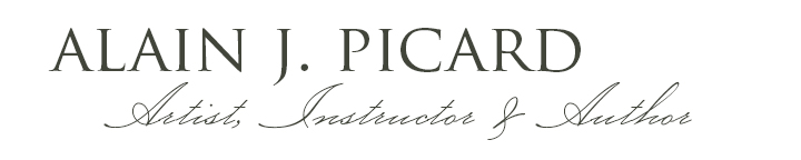
Last week, I painted three vine-ripe tomatoes during a live lesson for The Painterly Still Life Course. The whole lesson was focused on expressive mark-making, how to understand it, build your vocabulary, and apply your mark-making voice in a painting.
As I worked through the exercises alongside my students, this insight was resonating within me. The pleasure of laying down a confident stroke and leaving it alone. The energy that comes from a mark made with intention and trust. This tomato painting punctuated for me just how significant mark-making is to my own joy and process.
Conversation in Red, 9x12” pastel on UART400
Mark-making is not an extra decoration laid on top of a painting. It’s the voice of the artwork. It carries the rhythm, the energy, the emotion. When you build a vocabulary of marks, you give yourself a language for expression that goes far beyond rendering what you see.
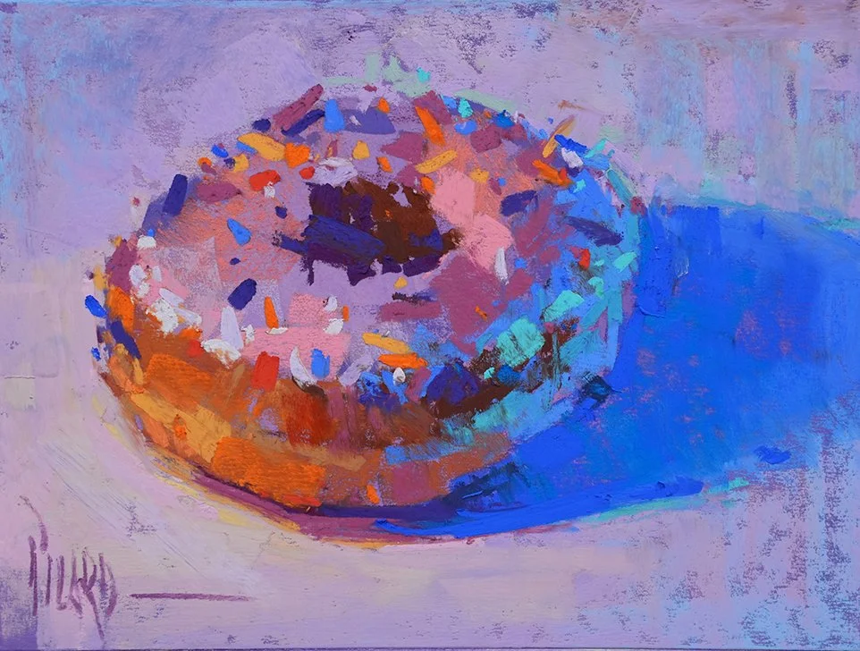
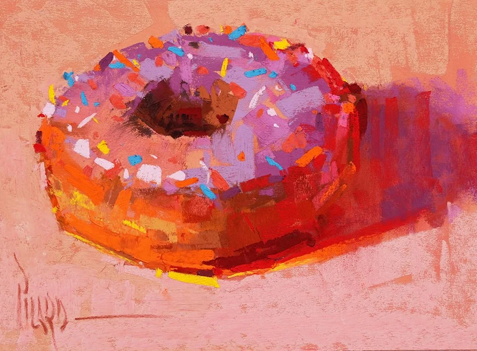
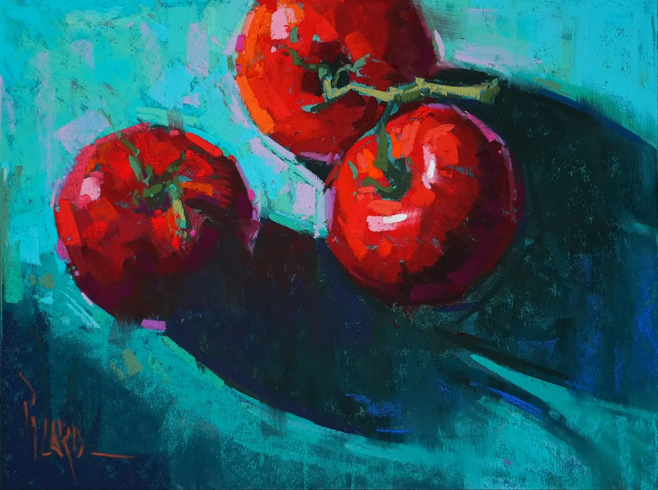
Two pears, painted with very different approaches to marks:
LEFT: Linear Strokes, RIGHT: Side Strokes
Same subject, two completely different voices. The vocabulary of marks changes the expression.
If you want to accelerate your own visual vocabulary, the Expressive Mark-Making Mini Course was created to do exactly this. Four focused lessons designed to expand your range and free up your painting hand.
Learn more about the Expressive Mark-Making Mini Course HERE.
Here’s to making your mark,
Alain
The Mini Course is fully self-paced, so you can work through it whenever inspiration strikes. If you've ever felt your voice isn't coming through clearly in your paintings, this is a great place to start.