How to Paint Loose, Expressive Landscapes

Ever struggle with overworking your landscape paintings? 

Palm trees are a good test of your resolve. All those big fronds and tiny leaflets inviting you to draw every line. Just by observing too closely the painting can stiffen up before you know it.
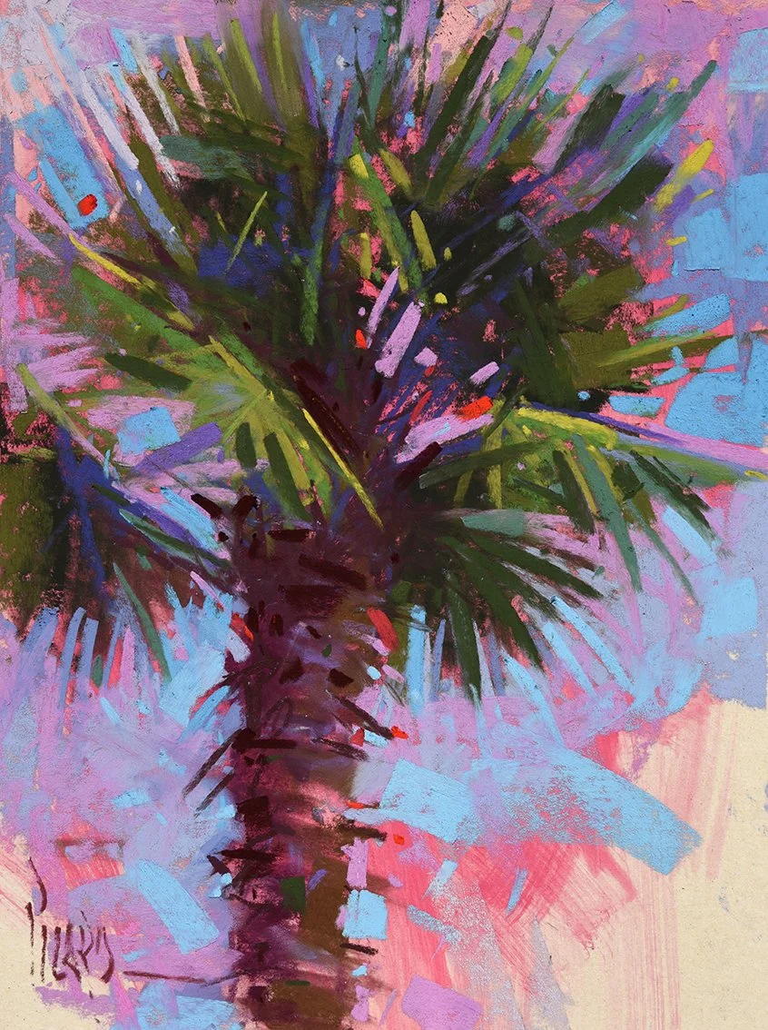
I painted this colorful palm tree on location in Croatia. Standing before that single palm against a big blue sky, I reached for pink, violet and deep crimson. Nothing static, nothing rendered. The color is my response to the moment rather than a record of what was actually there. The energy of the wash and pastel marks is where the movement comes from. Expressive color brings feeling.

So how do we capture that energy and life?

Luckily I snapped a photo of that palm tree, so we can paint it together. We'll look at:

✔️ Bold marks that carry energy
✔️ Color that brings life to the scene
✔️ Suggestion over detail for a painterly result

This painterly approach is a taste of what unfolds in The Painterly Landscape Course. You'll discover the power, fun and freedom of using bold marks and expressive color in your paintings with a complete Painterly Roadmap to guide you. We're also giving the Practice Makes Painterly Bonus to everyone who enrolls in the course before September 9 at 7pm ET when the doors close. This helpful guide is packed with 6 exercises for loose, fresh painting, including the 100-stroke challenge.


Want to paint loose and free? Now's your chance. Enroll in The Painterly Landscape Course by Wednesday, September 9 at 7pm ET, and take the first step toward bolder, looser paintings in pastel that impact the viewer with energy and expression. Seven Milestones take you on a journey of transformation in your landscape painting from design all the way to a beautiful destination. 
Beyond Green: How Expressive Color Brings Landscape Paintings to Life

Have you ever been overwhelmed by green?

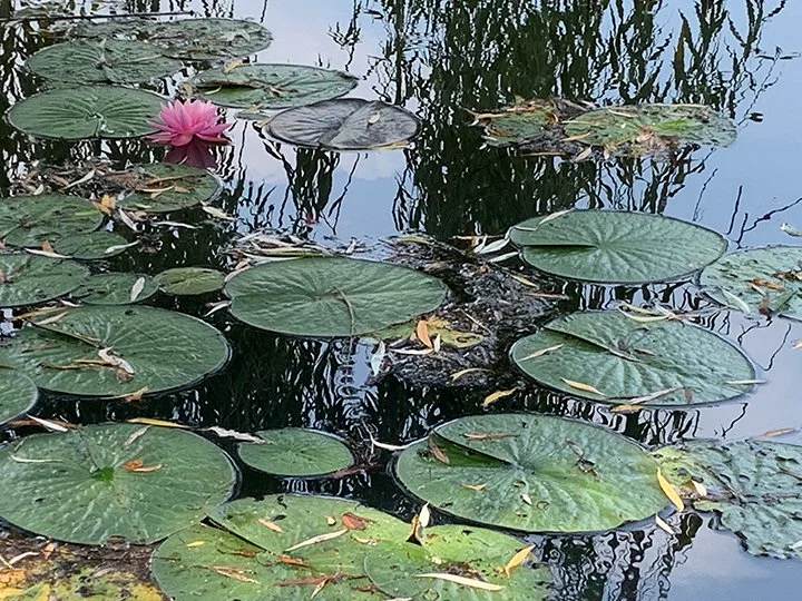
Everything in front of me that morning was green.
Green willow. Green pads. Green reflection running through green water. A summer lotus pond doing what a summer pond does best.

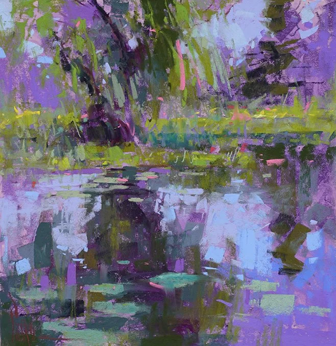
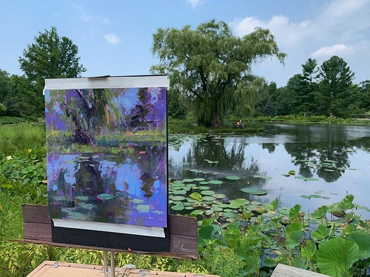
So I painted it violet.

Not because violet is a clever trick, and not because I was trying to be different. I painted it violet because after a few minutes of standing there, I stopped asking myself, “What color is that?” and started asking, “How does this place make me feel?” Two very different questions, and they lead to two entirely different paintings.

Lotus Pond, 12x12" pastel

Here's what I want to encourage you with, and it took me years to trust;

You can let go of description without letting go of design.

Look at the painting and you'll see the pond is still there. The willow sits where the willow belongs. The shoreline runs where it should. The reflection drops straight down beneath the tree and holds the whole square together. The pads get smaller as they travel back. Everything structural is faithful.

What I threw away was the detailed description. The local color. The tidy edges. Every fact about what a lily pad actually looks like when you lean over and stare at one.

All that information, and I used almost none of it.

That's the trade-off, and I’ll take it every time. Most of us think we owe the scene an accurate report. Truth is, we’ve got cameras for that. As artists, what we owe is an honest response.

Monet understood this better than anyone. He painted the same pond hundreds of times, and it was never really about the water. The surface was an excuse. An excuse to chase color, to arrange shapes, to make marks, to wonder. The pond gave him permission to play, and he took it for the rest of his life.


So here's my summons for you this summer.

Go stand in front of something green and refuse to paint it green.

Keep the design. Get the big shapes right. Put the darks where the darks belong. Then let the color be yours. Let it be violet, sienna, burgundy or gold, whatever your heart is longing for. Nobody who sees your painting will hold you to what was actually there. 

They'll only ask whether it feels alive. 

They want to feel what you feel.

And trust me, they will.

Keep painting,
Alain

This is the kind of playful discovery we do together during Landscape Week, coming up August 31- September 4. Three live lessons, three ways to loosen up.

3 Ways to Paint More Dramatic Cloudscapes

Have you ever stood beneath a beautiful open sky, watching the clouds dance across the horizon, and wished you could capture that magic in pastel? You're not alone. Cloudscapes have captivated artists for centuries—from Turner's luminous skies to Constable's billowing cumulus formations.

The good news? Creating compelling cloudscapes is more accessible than you might think. Here are three simple ways to elevate your cloud paintings from ordinary to extraordinary:

After the Rain, 6x12” pastel

1.     Lower Your Horizon Line 

One of the quickest ways to create drama in your cloudscapes is to place your horizon in the bottom third of your picture plane—or even lower. This simple compositional choice gives clouds the starring role they deserve. Instead of competing with landscape elements, your sky becomes the main event. Think of it as giving your clouds a bigger stage to perform on. The vast expanse invites viewers to look up and lose themselves in your atmospheric creation.

Beautiful Horizons, 9x12” pastel

2.     Explore Color Beyond White 

Here's a secret: clouds are never just white. They're complex mirrors reflecting the world around them. I love those peachy pinks at dawn, the blue-violets in the shadows, golden amber at sunset. Start observing how the time of day transforms cloud colors. Try this: paint the same cloud formation at different times using limited color palettes. Morning might call for warm yellows and cool purples, while storm clouds demand dramatic grays with silvery highlights. This practice will transform your clouds from flat white shapes into living, breathing atmosphere.

Clouds Over Sweden, 9x12” pastel

3.     Master the Art of Edges 

Hard, cut-out cloud shapes lack finesse and depth. Real clouds are vaporous and ephemeral, merging and flowing into the sky around them. Practice varying your edges: keep them soft where clouds dissipate into atmosphere, firmer where sunlight creates definition against deep-colored sky. Think of painting clouds like capturing smoke or mist. Let your pastels dance between definition and suggestion, creating that magical texture and soft quality that makes viewers feel they can reach up and touch the moisture in the air.


Your Creative Challenge 

This week, grab a small paper and a handful of pastels, and try just one of these techniques. Aim for exploration, not perfection. Paint a simple cloudscape with a low horizon or focus entirely on capturing the colors of clouds at your favorite time of day. Remember, mastering cloudscapes starts with a single stroke on paper as you reach toward the sky.

Please share your cloudscape with me on Facebook or Instagram using #LearnwithAlainPicard. I look forward to seeing what you have created!

How to Create Expressive Floral Abstractions This Spring

Spring is a wonderful season of rebirth, and there’s nothing quite like florals to allow our creative spirits to bloom in new ways. I’ve recently discovered this magic myself by moving beyond literal representation to capture the emotional essence of a subject. This resulted in an expressive floral abstraction that speaks to the heart.

Alain Picard, L’Essence de L’Amour, 12x12” pastel on UART 400

Here are a few thoughts on my experience so you can explore your own floral abstractions.

The Power of Personal Expression

When you integrate design principles with color knowledge and your own unique touch, something wonderful happens. Your personal artistic voice begins to flourish, allowing you to interpret floral subjects with fresh emotion and perspective. Let your design ideas lead you in this exploration of the abstract. Then layer the poetry of color upon this foundation. 

Soft pastels can offer an ideal medium for this exploration. Their velvety texture creates both delicate subtleties and bold presence that can transform a floral subject like pink peonies into abstract expressions of beauty.


Finding Your Flow

Successful floral abstraction involves listening and responding to what emerges on your surface. The empowering truth is that you can leave as much of the representational aspect behind as you wish. Some of us will hold onto more recognizable elements of our subject while emphasizing abstract qualities. Others will venture into pure abstraction where only color, form, and emotion remain. Each journey into abstraction can be as unique as you are, so be bold and explore.

Consider these approaches to enhance your expressive work:

  • Seeds of Design: Harness the power of value shapes as the seeds of your abstract design 

  • Dynamic Textures: Allow the gritty, intimate qualities of your materials to become part of your expression

  • The Power of Scale: Larger works often bring new power and dimension to your abstractions

  • Multimedia Exploration: Underpaintings in watercolor or acrylic can add exciting and spontaneous new dimensions to your abstraction


Let Your Creativity Blossom

This spring, I invite you to create an expressive floral abstraction that flows from your unique artistic voice. Let your own personal design elements and color choices take root as your expressive side blossoms with new life. Move from observation into heartfelt expression as you allow how you feel about the subject to take priority over the facts set before you.

Whether your creative voice is just beginning to bud or reaching full bloom, we’re all tending this creative garden together. That is a beautiful sight to behold. 

Pastel Clouds Made Easy


Alain Picard, Clouds, 9x12” pastel


Ready to master the art of painting billowing clouds in pastel? Dive into this video lesson, where you’ll learn techniques to bring your clouds to life with depth, texture, and color.

You’ll explore themes like:

  • Building Depth: Layering colors and sculpting masses with positive and negative shapes.

  • Edge Control: Balancing hard, soft, and lost edges for vaporous effects.

  • Color Harmony: Connecting colors between water and sky, using neutrals and chromatics.

  • Light & Shadow: Creating atmospheric transitions, adding warmth, and reflecting sky in water.

  • Mark-Making and Blending Techniques: Softening edges for vertical reflections and adding impasto effects.

This video lesson has been newly edited and re-released so you can create your own stunning clouds that sparkle with life and color. It's packed with techniques and insights to elevate your pastel landscapes! 🏆

My Secondary Palette Box

In my last post I shared how I set up my Pastel Palette for Portraits today I want to dive into my secondary setup.

This is my secondary palette box. This box of six rows is organized by color families from left to right. Beginning at the left and moving right you'll see cool violet/warm violet, red and orange, yellow/warm green,  green/blue-green, blue, and finishing with neutral grays. As always, I've placed light values at the top, and dark values at the bottom. This palette is wonderful for backgrounds for my portrait subjects as well as just about anything else from still life to landscape. My compliments to John Heilman for the great travel box from HeilmanDesigns.com

In our Painterly Portrait course we not only talk about how to create amazing portraits using pastels but we also talk about efficiency strategies such as this to make your painting time fun and stress-free.