Your Paper Mounting Challenges Solved!
Do you ever feel frustrated trying to mount your beautiful pastel papers to boards? You're not alone! As artists who love working on those wonderfully gritty, sanded surfaces that make our pastels sing, we've all faced the mounting challenge. Those sanded or coated papers that give us such gorgeous results can also give us challenges if left unmounted, leading to curling, buckling and warping in unsightly ways that make framing a challenge.
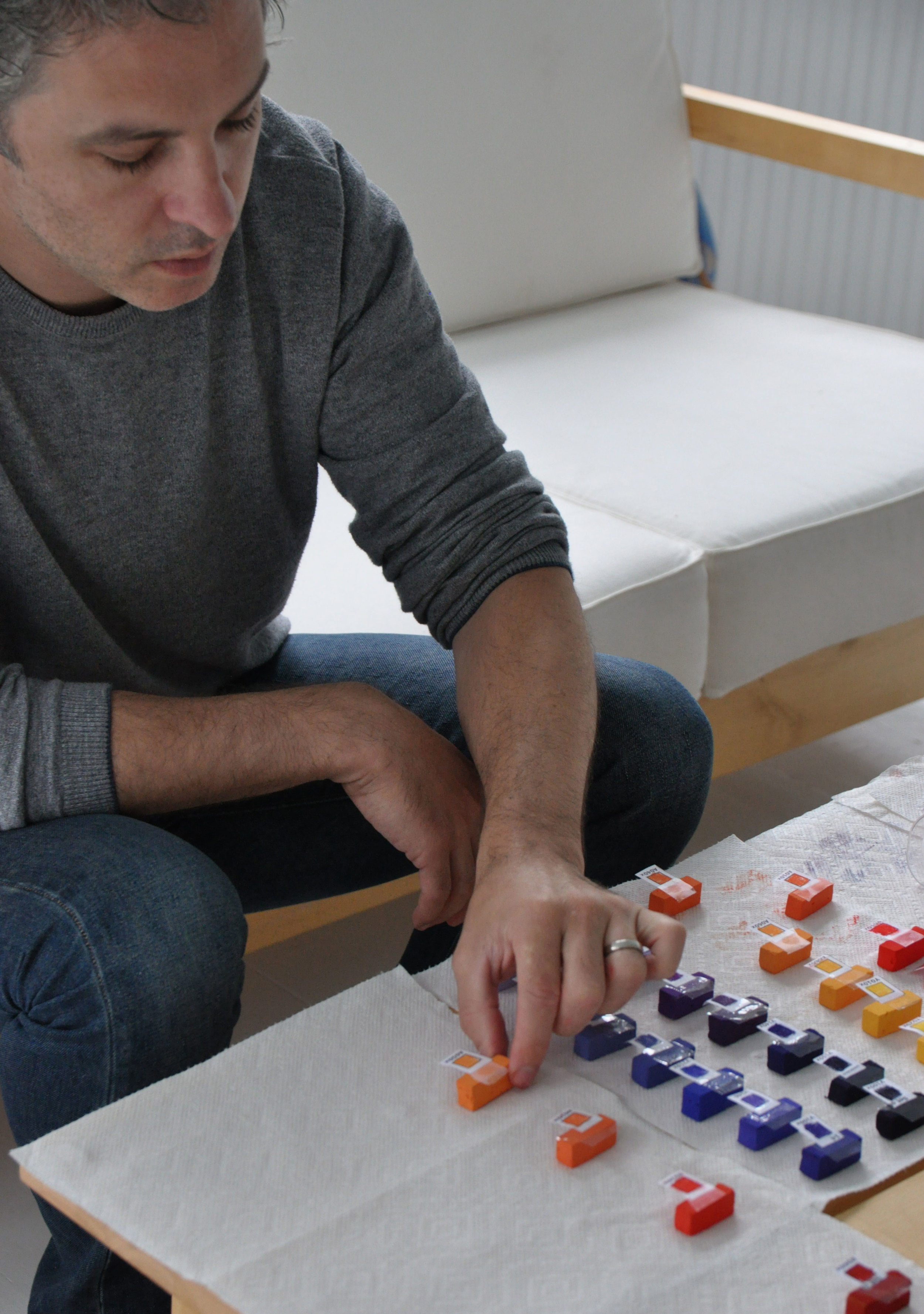
I’ve been there – literally spending decades perfecting my mounting process using gatorboard and various adhesives. When my go-to product, 3M 568 positionable mounting adhesive, was discontinued, I felt that familiar artist panic: "Now what do I do?"

Citrus & Silver, 9x20 pastel on UART Dark
Here's the good news: I've discovered not just one, but two fantastic solutions that will make your mounting process easier and more reliable than ever.
Solution #1
Professional-Grade Adhesive Film After extensive testing, I've found an excellent replacement in the double-sided adhesive film rolls from Artgrafix.com. This high-tack, acid-free adhesive is specifically designed for archival mounting and comes in both sheets and rolls to fit your needs.
Why it works so well:
Acid-free for long-term preservation
Strong, permanent bond
Works beautifully with 4-ply or 8-ply museum board, 3/16" Gator board, and Sintra board
Available in various sizes to match your preferred working dimensions
Pro tip: Many boards are now available with self-adhesive backing – just peel and stick!
Solution #2
The Game-Changer – UART Peel-N-Stick Sheets This is where I get really excited! UART has just introduced their brand-new Peel-N-Stick sanded sheets – and they're a complete game-changer for pastel artists.
What makes these special:
Self-adhesive backing (no more fumbling with separate adhesives!)
Available in both sanded and dark papers
Professional-quality surface you already know and love
Simply peel, stick to your favorite board, and start painting
I'm particularly honored that UART featured my painting "Citrus & Silver" (9x20" on UART Dark) on the cover of their new dark paper packaging. I love working on their dark surface in both 400 and 500 grits – there's something magical about how pastels glow against that rich background. Explore the full range here.

Join Me for a Special Landscape Adventure!
Mark your calendar: September 8-12, 2025
Ready to break free from perfection and experience the joy of loose, expressive landscapes?
Over three live sessions, I'll guide you through breakthrough exercises that unlock painting freedom and help you make a bigger impact through your work. Come enjoy a fresh dose of confidence-building play!
SAVE YOUR SEAT for Landscape Week. I can't wait to share this experience with you!